
Use Frequency More Frequently
A handbook from simple to advanced frequency analysis: exploring a vital tool which is widely underutilized in data science

Frequency analysis is extremely useful in a vast number of domains. From audio, to mechanical systems, to natural language processing and unsupervised learning. For many scientists and engineers it’s a vital tool, but for many data scientists and developers it’s hardly understood, if at all. If you don’t know about frequency analysis, don’t fret, you just found your handbook.

Who is this useful for? Anyone who works with virtually any signal, sensor, image, or AI/ML model.
How advanced is this post? This post is accessible to beginners and contains examples that will interest even the most advanced users of frequency analysis. You will likely get something out of this article regardless of your skill level.
What will you get from this post? Both a conceptual and mathematical understanding of waves and frequencies, a practical understanding of how to employ those concepts in Python, some common use cases, and some more advanced use cases.
Note: To help you skim through, I’ve labeled subsections as Basic, Intermediate, and Advanced. This is a long article designed to get someone from zero to hero. However, if you already have education or experience in the frequency domain, you can probably skim the intermediate sections or jump right to the advanced topics.
1) The Frequency Domain
First, what is a domain? Imagine you want to understand temperature changes over time. Just reading that sentence, you probably imagined a graph like this:
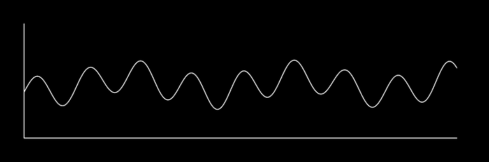
Maybe you imagine time progressing from left to right, and greater temperatures corresponding to higher vertical points. Congratulations, you’ve taken data and mapped it to a 2d time domain. In other words, you’ve taken temperature readings, recorded at certain times, and mapped that information to a space where time is one axis, and the value is another.
There are other ways to represent our temperature vs time data. As you can see, there’s a “periodic” nature to this data, meaning it oscillates back and forth. A lot of data behaves this way: sound, ECG data from heartbeats, movement sensors like accelerometers, and even images. In one way or another, a lot of things have data that goes to and from periodically.
“If you want to find the secrets of the universe, think in terms of energy, frequency and vibration.” ― Nikola Tesla
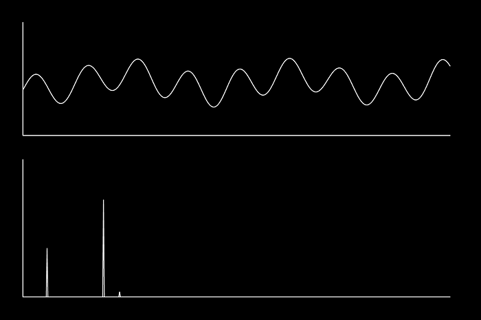
I could get to this point in a circuitous way, but a picture speaks 1000 words. In essence, we can disassemble our temperature graph into a bunch of simple waves, with various frequencies and amplitudes (frequency being the speed it goes back in forth, and amplitude being how high and low it goes), and use that to describe the data.
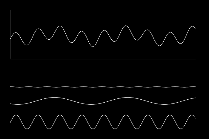
These waves are extracted using a Fourier Transform, which maps our original wave from the time domain to the frequency domain. Instead of value vs time, the frequency domain is amplitude vs frequency.
So, to summarize, the Fourier Transform maps data (usually, but not always in the time domain) into the frequency domain. The frequency domain describes all of the waves, with different frequencies and amplitudes, which when added together reconstruct the original wave.
1.2) The Specifics of the Frequency Domain (Intermediate)
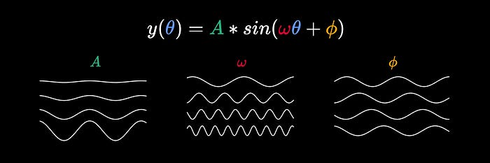
The sin function is the ratio of the opposite side of a triangle vs the hypotenuse of that right triangle, for some angle.

The sin wave is what you get when you plot a/c for different values of θ (Different Angles), and is used in virtually all scientific disciplines as the most fundamental wave.

Often sin(θ) is expanded to A*sin(ωθ+ϕ).
ω(omega) represents frequency (larger values of ω mean the sin wave oscillates more quickly)
ϕ(phi) represents phase (changing ϕ shifts the wave to the right or left)
A scales the function, which defines the amplitude (how large the oscillations are).
When I explained the frequency domain I presented a simplified representation, where the horizontal axis is frequency, and the vertical axis is amplitude. In actuality the frequency domain is not 2 dimensional, but 3: one dimension for frequency, one for amplitude, and one for phase. A spectrogram can be of even higher dimension for higher dimensional signals (like images).
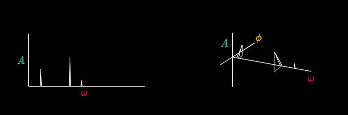
When converting a signal to the frequency domain (using a library like scipy, for instance) you’ll get a list of imaginary numbers.
[1.13-1.56j, 2.34+2.6j, 7.4,-3.98j, ...]If you’re not familiar with imaginary numbers, don’t worry about it. You can imagine these lists as points, where the index of the list corresponds to frequency, and the complex imaginary number represents a tuple corresponding to amplitude and phase respectively.
[(1.13, 1.56), (2.34, 2.6), (7.4, -3.98), ...]I haven’t talked about the units of these numbers. Because units are, essentially, linear transformations to all data, they can often be disregarded from a data science perspective. However, if you do use the frequency domain in the future, you will likely encounter words like Hertz (Hz), Period (T), and other frequency domain-specific concepts. You will see these units explored in the examples.
If you want to learn more about units in general, and how to deal with them as a data scientist, I have an article all about it here.
1.3) A Simple Example in Python (Intermediate)
In this example, we load a snippet of trumpet music, convert it to the frequency domain, plot the frequency spectrogram, and use the spectrogram to understand the original signal.
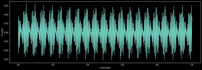
First, we’ll load and plot the sound data, which is an amplitude over time. This data is used to control the location of the diaphragm within a speaker, the oscillation of which generates sound.
"""
Loading a sample waveform, and plotting it in the time domain
"""

#importing dependencies
import matplotlib.pyplot as plt     #for plotting
from scipy.io import wavfile        #for reading audio file
import numpy as np                  #for general numerical processing

#reading a .wav file containing audio data.
#This is stereo data, so there's a left and right audio audio channel
samplerate, data = wavfile.read('trumpet_snippet.wav')

#creating wide figure
plt.figure(figsize=(18,6))

#defining number of samples we will explore
N = 3000

#calculating time of each sample
x = np.linspace(start = 0, stop = N/samplerate, num = N)

#plotting channel 0
plt.subplot(2, 1, 1)
plt.plot(x,data[:N,0])

#plotting channel 1
plt.subplot(2, 1, 2)
plt.plot(x,data[:N,1])

#rendering
plt.show()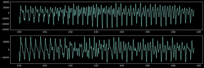
Lets convert these waveforms to the frequency domain
"""
Converting the sample waveform to the frequency domain, and plotting it

This is basically directly from the scipy documentation
https://docs.scipy.org/doc/scipy/tutorial/fft.html
"""

#importing dependencies
from scipy.fft import fft, fftfreq      #for computing frequency information

#calculating the period, which is the amount of time between samples
T = 1/samplerate
#defining the number of samples to be used in the frequency calculation
N = 3000

#calculating the amplitudes and frequencies using fft
yf0 = fft(data[:N,0])
yf1 = fft(data[:N,1])
xf = fftfreq(N, T)[:N//2]

#creating wide figure
plt.figure(figsize=(18,6))

#plotting only frequency and amplitude for the 1st channel
plt.subplot(2, 1, 1)
plt.plot(xf, 2.0/N * np.abs(yf0[0:N//2]))
plt.xlim([0, 6000])

#plotting only frequency and amplitude for the 2st channel
plt.subplot(2, 1, 2)
plt.plot(xf, 2.0/N * np.abs(yf1[0:N//2]))
plt.xlim([0, 6000])

plt.show()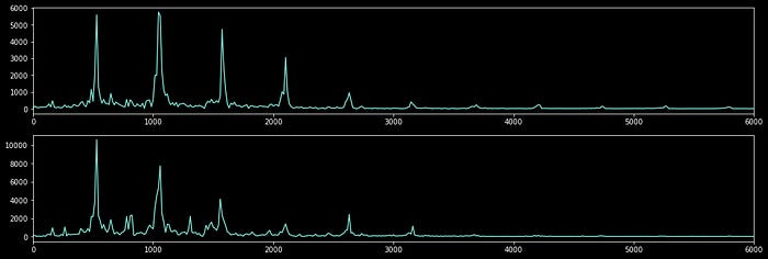
Just by visualizing this graph, a few insights can be made.
Both signals contain very similar frequency content, which makes sense because they’re both from the same recording. Often stereo recordings are recorded with two separate microphones simultaneously.
The dominant frequency is around 523Hz, which corresponds to a C5 note.
There is a lot of sympathetic resonance, which can be seen as spikes at frequencies that are at integer multiples of the base frequency. This trait is critical in making an instrument sound good and is the result of various pieces of the instrument resonating at different frequencies which is induced by the primary vibration.
This is a very clear sound, the spikes are not muddled by a lot of unrelated frequency content
This is an organic sound. There is some frequency content which is not related to the base frequency. This can be thought of as the timbre of the instrument and makes it sound like a trumpet, rather than some other instrument performing the same note.
In section 2 we’ll explore how the frequency domain is used commonly in time series signal processing. In section 3 we’ll explore more advanced topics.
2) Common Uses of the Frequency Domain
2.1) De-trending and Signal Processing (Intermediate)
Let’s say you have an electrical system, and you want to understand the minute-by-minute voltage changes in that system over the course of a day. You set up a voltage meter, capture, and plot the voltage information over time.
Let's say, for the purposes of this example, we only cared about the graph for the minute-by-minute data, and we consider waves which are too high of a frequency to be noise, and waves which are too low in frequency to be a trend that we want to ignore.
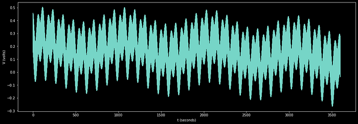
So, for this example, we only care about observing content which oscillates slower than once per second, and faster than once every 5 minutes. We can convert our data to the frequency domain, remove all but the frequencies we’re interested in observing, then convert back to the time domain. so we can visualize the wave including only the trends we’re interested in.
First, let’s observe the frequency domain unaltered:
"""
Plotting the entire frequency domain spectrogram for the mock electrical data
"""

#load electrical data, which is a numpy list of values taken at 1000Hz sampling frequency
x, y = load_electrical_data()
samplerate = 1000
N = len(y)

#calculating the period, which is the amount of time between samples
T = 1/samplerate

#calculating the amplitudes and frequencies using fft
yf = fft(y)
xf = fftfreq(N, T)[:N//2]

#creating wide figure
plt.figure(figsize=(18,6))

#plotting only frequency and amplitude for the 1st channel
plt.plot(xf, 2.0/N * np.abs(yf[0:N//2]))

#marking units of the two axis
plt.xlabel('fq (Frequency in Hz)')
plt.ylabel('V (Volts)')

#setting the vertical axis as logorithmic, for better visualization
plt.gca().set_yscale('log')

#rendering
plt.show()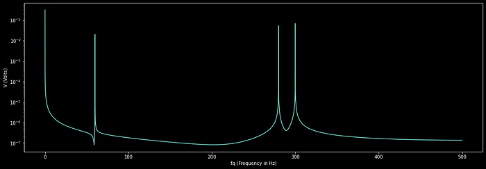
We can set all the frequency content we are not interested into zero. Often you use a special filter, like a butter-worth filter, to do this, but we’ll keep it simple.
"""
converting the data to the frequency domain, and filtering out
unwanted frequencies
"""

#defining low frequency cutoff
lowfq = 1/(5*60)

#defining high frequency cutoff
highfq = 1

#calculating the amplitudes and frequencies, preserving all information
#so the inverse fft can work
yf = fft(y)
xf = fftfreq(N, T)

#applying naiive filter, which will likely create some artifacts, but will
#filter out the data we don't want
yf[np.abs(xf) < lowfq] = 0
yf[np.abs(xf) > highfq] = 0

#creating wide figure
plt.figure(figsize=(18,6))

#plotting only frequency and amplitude
plt.plot(xf[:N//2], 2.0/N * np.abs(yf[0:N//2]))

#marking units of the two axis
plt.xlabel('fq (Frequency in Hz)')
plt.ylabel('V (Volts)')

#setting the vertical axis as logorithmic, for better visualization
plt.gca().set_yscale('log')

#zooming into the frequency range we care about
plt.xlim([-0.1, 1.1])

#rendering
plt.show()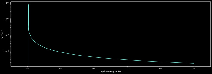
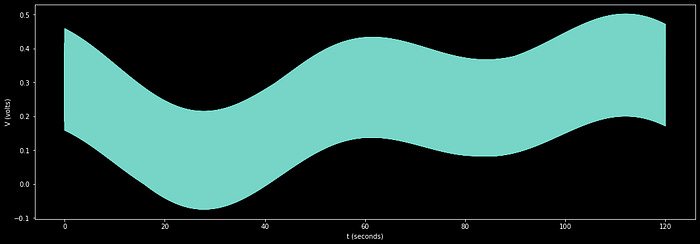
Now we can perform an inverse Fast Fourier Transform to reconstruct the wave, including only the data we care about
"""
Reconstructing the wave with the filtered frequency information
"""

#importing dependencies
from scipy.fft import ifft      #for computing the inverse fourier transform

#computing the inverse fourier transform
y_filt = ifft(yf)

#creating wide figure
plt.figure(figsize=(18,6))

#plotting
plt.plot(x,y_filt)

#defining x and y axis
plt.xlabel('t (seconds)')
plt.ylabel('V (volts)')

#looking at a few minutes of data, not looking at
#the beginning or end of the data to avoid filtration artifacts
plt.xlim([60*2,60*10])

#rendering
plt.show()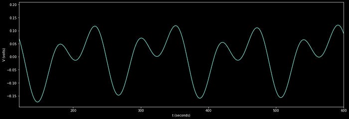
And that’s it. We have successfully removed high-frequency information we don’t care about, and centered the data we do care about around zero by removing low-frequency trends. We can now use this minute-by-minute data to hone in on understanding the electrical system we’re measuring.
2.2) Vibration Analysis (Advanced)
I covered vibration analysis in a previous example in the form of analyzing a sound wave. In this example, I’ll discuss analyzing vibrations in physical systems, like a motor in a factory.
It can be difficult to predict when certain motors require maintenance. Often, simple issues like a misalignment can cascade into much more severe issues, like a complete engine failure. We can use frequency recordings, collected periodically over time, to help us understand when a motor is operating differently; allowing us to diagnose issues within an engine before it cascades into a larger issue.
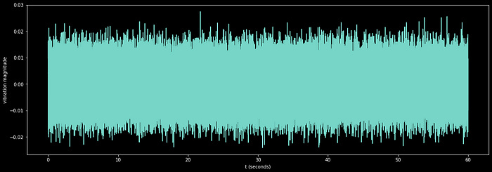
To analyze this data, we will compute and render what is called a mel spectrogram. A mel spectrogram is just like a normal spectrogram, but instead of computing the frequency content across the entire waveform, we extract the frequency content from small rolling windows extracted from the signal. This allows us to plot how the frequency content changes over time.
"""
plotting a mel-spectrogram of motor vibration to diagnose the point of failure

note: if you don't want to use librosa, you can construct a mel-spectrogram
easily using scipy's fft function across a rolling window, allowing for more
granular calculation, and matplotlib's imshow function for more granular
rendering
"""

#importing dependencies
import librosa              #for calculating the mel-spectrogram
import librosa.display      #for plotting the mel spectrogram

#loading the motor data
y = load_motor_data()
samplerate = 1000 #in Hz

#calculating the mel spectrogram, as per the librosa documentation
D = np.abs(librosa.stft(y))**2
S = librosa.feature.melspectrogram(S=D, sr=samplerate)

#creating wide figure
fig = plt.figure(figsize=(18,6))

#plotting the mel spectrogram
ax = fig.subplots()
S_dB = librosa.power_to_db(S, ref=np.max)
img = librosa.display.specshow(S_dB, x_axis='time',
                         y_axis='mel', sr=samplerate,
                         fmax=8000, ax=ax)
fig.colorbar(img, ax=ax, format='%+2.0f dB')
ax.set(title='Mel-frequency spectrogram')

#rendering
plt.show()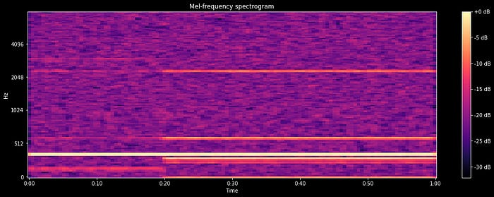
In a Mel Spectrogram, each vertical slice represents a region of time, with high-frequency content being shown higher up, and low-frequency content being shown lower down in the plot. It’s easy to see that at time 0.2 (20% through our data), the frequency content changed dramatically. At this point a balancing weight became loose, causing the engine to become unbalanced. Maintenance at this point may save the engine from excess wear in the future.
A simple yet effective way to employ this principle is with scheduled vibration readings. A worker sticks an accelerometer on the body of a motor with a magnet and records the frequency content once or twice a month. Those windows of vibration data are then converted to the frequency domain, where certain key features are extracted. A common extracted feature from the frequency domain is power spectral density, which is essentially the area under the frequency domain curve over certain regions of frequencies. Extracted features can be plotted over several weeks of recordings and used as a proxy for overall motor health.
3) Advanced Uses of the Frequency Domain
3.1) Data Augmentation (Advanced)
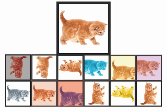
Data augmentation is the process of creating fake data from real data. The quintessential example is image classification to bolster a data set for classifying if images are of a dog or a cat.
Keep reading with a 7-day free trial
Subscribe to Intuitively and Exhaustively Explained to keep reading this post and get 7 days of free access to the full post archives.