
Graph Convolutional Networks — Intuitively and Exhaustively Explained
Applying AI to Complex Relationships


This article serves as an introduction to how artificial intelligence can be applied to graphs. Graphs are a fundamental way to represent interconnected information, like social networks, chemical compounds, financial transactions, and GPS data. Having a solid understanding of how AI can be applied to graphs serves as a gateway to applying AI to many real-world problems.
First, we’ll review what Graphs are, and how they can be used to organize certain types of interconnected information. Then, we’ll explore how artificial intelligence can be applied to graphs from a conceptual perspective. Once we have a general idea of the approach, we’ll work on a practical example; using a graph convolutional network to predict which topic an academic paper belongs to based on the papers it references.

Who is this useful for? Anyone who wants to form a complete understanding of AI, and is focused on applying AI to solve real-world problems.
How advanced is this post? Graph-based modeling strategies are incredibly powerful, and relatively simple, but are not as popularly discussed as many other modeling strategies. Thus, this article is relevant to readers of all levels.
Pre-requisites: You can get a lot out of this article having no prior experience in software development or AI. However, if you do get stuck, I recommend the two following articles.
This one is an introduction to AI as a whole:

And this one is an introduction to graphs:

A Brief Introduction to Graphs
Before we dive into applying AI to graphs, we need to form an understanding of what a graph even is. The following section is a brief summary of my article on the subject.
First of all, we’re not talking about this:

We’re talking about this:
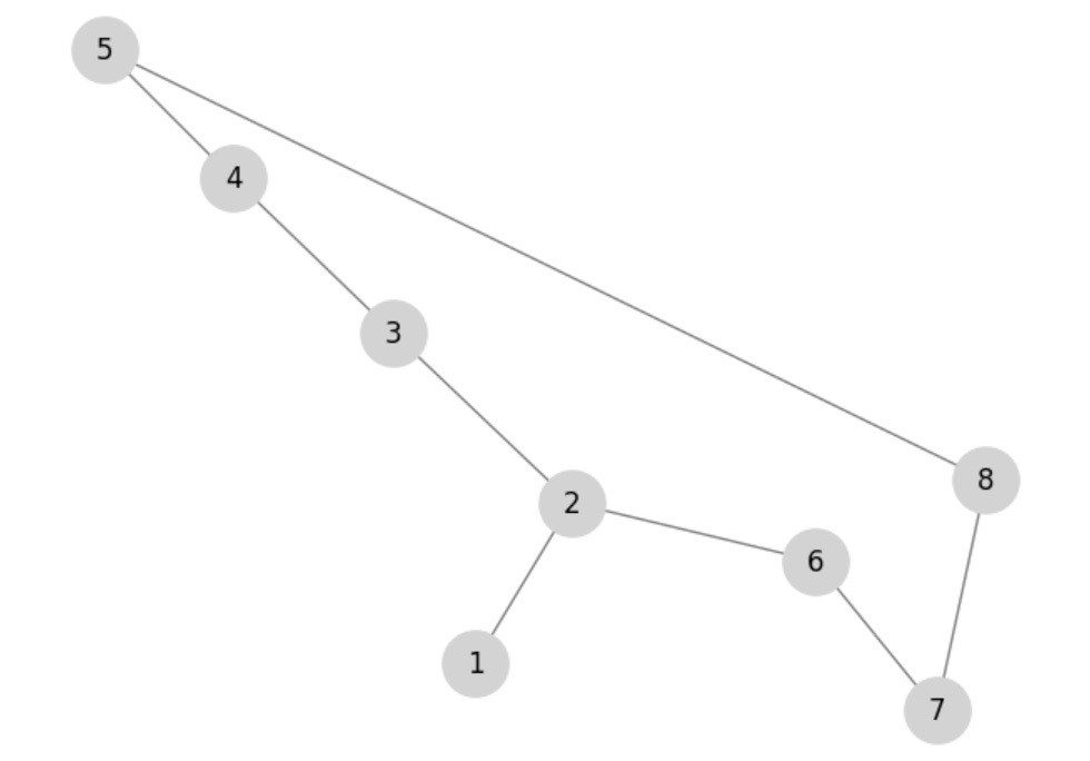
For our purposes, the first thing is a “plot” and the second thing is a “graph”. I know this is confusing; I have no idea why mathematicians decided to give two separate and incredibly important things the same name.
A graph is a way to represent entities and how they relate with each other, using “nodes” and “edges”. The nature of these nodes and edges can vary greatly from application to application. They can represent roads and destinations, which classes are shared by students in a university, social media connections, or processes within some greater flow of operations.

A popular Python library for creating and manipulating graphs is called networkx. Here’s an example of creating a graph using networkx
import networkx as nx
import matplotlib.pyplot as plt

# creating a graph
graph = nx.Graph()

# adding edges to the graph
graph.add_edge('A','B')
graph.add_edge('A','C')
graph.add_edge('A','D')
graph.add_edge('D','B')

# rendering the graph
plt.figure(figsize=(12, 3))
nx.draw(graph, with_labels=True, node_color='lightgray', edge_color='lightgray')
My article on graphs explores a bunch of theory and processing. In this article, we’ll be exploring how AI can be applied to real-world data which happens to be best represented as a graph. Let’s kick it off by exploring a popular, graphical AI dataset.
Defining a Graph Problem
In this article, we’ll be focusing on the “Cora” dataset, which is many data scientists first practical introduction into applying AI to graph data. The Cora dataset consists of many academic papers about artificial intelligence which are labeled to belong to some academic domain.

There are papers about the theory of AI, neural networks, and other topics. These are all the domains recognized within the Cora dataset:
0: "Theory",
1: "Reinforcement_Learning",
2: "Genetic_Algorithms",
3: "Neural_Networks",
4: "Probabilistic_Methods",
5: "Case_Based",
6: "Rule_Learning"
Pretty much every academic paper has a long list of references.

The idea of the Cora dataset is this; if some new paper came onto the scene that had some content and some references, can we predict which academic domain that paper belonged to?

Before we get into hard-core graphical AI, let’s play around with some ways we might solve this problem using simple graph analysis and basic AI approaches. This will allow us to build an intuition on how these types of problems might be solved and also form a more thorough understanding of the Cora dataset.
Classification With Majority Voting, and Dataset Partitioning
One super simple way to approach Cora is to simply use “majority voting”. If we‘re curious about if a certain paper belongs to this or that domain, we can look at all the papers that the paper in question references. If most of the references are from a particular domain, we can just assume our paper is also from that domain.

This might work, or it might not. The only way we can know is by testing it out. Before we go about building this approach, though, I’d like to explore how testing is done in a graph modeling context.
In many practical AI applications, there is the concept of a “dataset partition”. When you train an AI model it can be difficult to know if it learned generally applicable trends in the data, or memorized weird quirks in the dataset that won’t generalize well to new data.
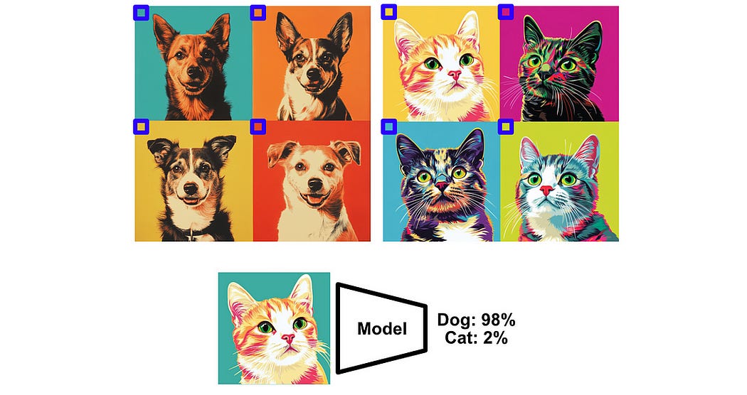
Data scientists confirm that the model they’ve made is actually useful by using holdout sets. These are sets of data that are hidden from the model during training such that they can be used to test the model’s generalizability.
This is easily done in many domains. If you wanted to build an AI model to tell the difference between cats and dogs, for instance, you just preserve a few images in a holdout set for testing.
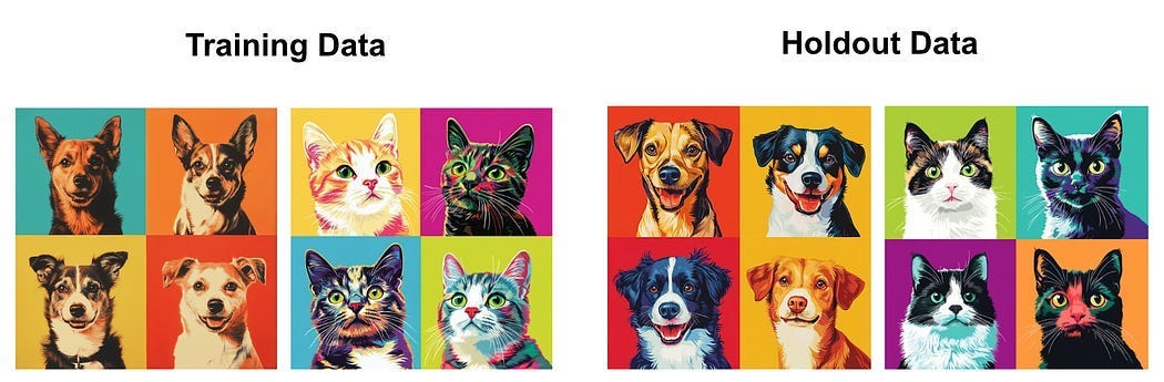
In our Cora dataset, though, this task isn’t so simple. We have one giant graph with many interconnected documents, where the relationship between those documents is important information. If we rip a document out of the graph and save it for testing, we fundamentally change the nature of that document and the graph as a whole.

Therefore, in graph classification tasks, it’s common to employ a partitioning mask. Essentially, we don’t literally separate documents apart from each other, but we only train on certain documents and we test on different documents.

This will make more sense as we progress through the article, but the fundamental idea is that we’ll arbitrarily decide on a certain subset of documents to train on, and then we’ll test on a different subset.
The Cora dataset has a mask for three partitions “train, test, and validate”. Majority voting doesn’t require any optimization, we’re literally just using the most common connected classification to infer the classification of a particular node, so we don’t actually need partitions to validate majority voting. We’ll go ahead and use the test partition anyway, just to make the results of majority voting comparable to other strategies we’ll be playing around with.
We go through each node in the test partition, look at all the connected nodes, and use the most common class of the connected nodes to infer the class of each node. I don’t want to get bogged down in loading and understanding the whole dataset just yet, I’ll be covering that in a bit. I wanted to include this code so you might get a general idea of how majority voting might work in this context. If this looks like French to you, don’t worry about it.
"""Majority voting
there's some code that happens before this point. we've already defined
the graph, connections, the labels for each node, and so on. We're using
this data to iterate through all of the nodes in the test set, and compare
the actual label to the results of labeling based on majority voting.
"""

from collections import Counter

correct = 0
total = 0

# Iterate through all test nodes
for node_idx in torch.where(data.test_mask)[0]:
    neighbors = list(G.neighbors(int(node_idx)))

    # Consider only labeled neighbors (training nodes)
    neighbor_labels = [int(data.y[neighbor]) for neighbor in neighbors if data.train_mask[neighbor]]

    if neighbor_labels:
        # Predict using majority voting
        predicted_label = Counter(neighbor_labels).most_common(1)[0][0]
    else:
        # Default prediction if no labeled neighbors: majority label in training set
        predicted_label = Counter(data.y[data.train_mask].tolist()).most_common(1)[0][0]

    true_label = int(data.y[node_idx])

    if predicted_label == true_label:
        correct += 1
    total += 1

accuracy = correct / total
print(f"Majority-vote accuracy on test nodes: {accuracy:.4f}")
This isn’t too bad. Because there are seven classes, a random choice would yield a performance of 0.14 (14% accuracy), so there’s some merit to using the structure of the graph to infer the class of a node.
Before we get into the fancy stuff, let’s play around with another simple modeling strategy. Majority voting only considered connections between papers and didn’t consider the content of the papers themselves. In the next example, we’ll only consider the content of the papers and disregard all connections.
Node Classification with a Simple Neural Network
In the previous approach, majority voting, we only used relationships between documents to decide on the classification of a particular document. In this example, we’ll disregard relationships between documents and focus on the information the Cora dataset provides for the documents themselves.
For each document in the Cora dataset a “bag of words” is provided. In this case, a “bag of words” consists of a vector of numbers stating if a certain word does, or does not, appear.

The Cora dataset tracks the inclusion of 1433 words for each document as a vector of 0’s and 1’s.

I did some digging online and it’s surprisingly hard to find details on exactly how the bag of words was created, or what words were even used. Most datasets simply provide a vector of 1’s and 0’s for each document which corresponds to some unknown vocabulary.
I did manage to dig up an R library that has, what appears to be, the vocabulary of the Cora dataset, you can see how I dug that up in the full code if you’re curious. Here’s an example of the first 20 words in the vocabulary.
computer
algorithms
discovering
patterns
groups
protein
sequences
based
fitting
parameters
statistical
model
group
related
include
hidden
markov
multiple
sequence
alignment
...
So, to recap, the Cora dataset has connections as to which academic papers cited each other.
And also has a bag of words associated with each of these papers.
We previously used majority voting where we only considered the connections between documents to predict which class a document belongs to. Here, we’ll be disregarding the connections completely and only looking at the bag of words associated with each document to make a prediction. To do that, we can build a simple neural network that takes in a bag of words and spits out a prediction.

Creating a dataset for this form of training simply consists of extracting all of the documents in the training partition of the graph, training a neural network based on a bag of words, and then testing how well we do based on the test partition.
Again, I don’t want to get too in the weeds just yet, but here’s some code for my more savvy readers.
import torch.nn.functional as F

# Define a simple neural network (MLP)
class SimpleMLP(torch.nn.Module):
    def __init__(self, input_dim, hidden_dim, output_dim):
        super(SimpleMLP, self).__init__()
        self.fc1 = torch.nn.Linear(input_dim, hidden_dim)
        self.fc2 = torch.nn.Linear(hidden_dim, output_dim)

    def forward(self, x):
        x = F.relu(self.fc1(x))
        return self.fc2(x)

# Initialize the model
model = SimpleMLP(dataset.num_features, 32, dataset.num_classes)
optimizer = torch.optim.Adam(model.parameters(), lr=0.01)

train_losses = []
val_losses = []

# Training loop
for epoch in range(15):
    model.train()
    optimizer.zero_grad()
    out = model(data.x)
    loss = F.cross_entropy(out[data.train_mask], data.y[data.train_mask])
    loss.backward()
    optimizer.step()

    train_losses.append(loss.item())

    # Validation
    model.eval()
    with torch.no_grad():
        val_out = model(data.x)
        val_loss = F.cross_entropy(val_out[data.val_mask], data.y[data.val_mask])
        val_losses.append(val_loss.item())

# Plot losses
plt.figure(figsize=(10, 5))
plt.plot(train_losses, label='Training Loss')
plt.plot(val_losses, label='Validation Loss')
plt.xlabel('Epoch')
plt.ylabel('Loss')
plt.title('Training and Validation Loss')
plt.legend()
plt.show()

# Evaluate on test set
model.eval()
with torch.no_grad():
    logits = model(data.x)
    preds = logits[data.test_mask].argmax(dim=1)
    correct = (preds == data.y[data.test_mask]).sum().item()
    total = data.test_mask.sum().item()

test_accuracy = correct / total
print(f"Test accuracy: {test_accuracy:.4f}")
Recall that we achieved 45% accuracy when only using majority voting, and now we achieved 49% accuracy when using only the bag of words information available to each node. Wouldn’t it be great if we could somehow use both the information within nodes and their connections to make better predictions? We can, which is the point of this article!
Graph Convolution vs. Regular Convolution
Some of my more regular readers might be familiar with the idea of convolution. If you ask a data scientist about convolution, their first thought will likely go towards image understanding, where you apply a very small model throughout an image.
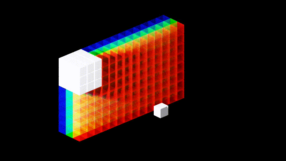
This small model is often referred to as a “kernel”, and you can use multiple of these kernels to create multiple parallel representations of an image.
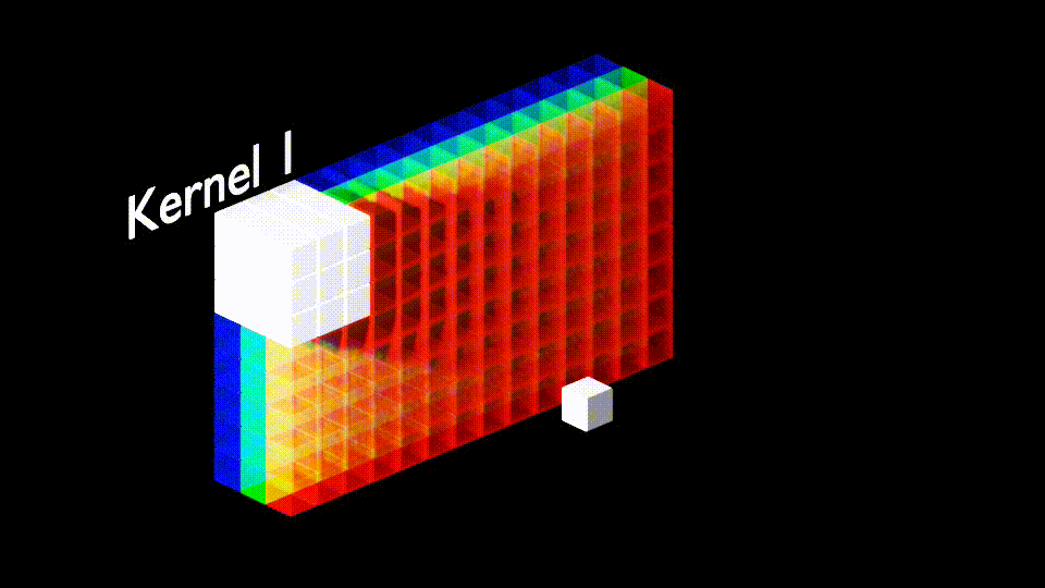
A common approach to creating models to understand images is to stack many of these convolutional layers on top of each other. Each layer using previous layers to make incrementally more abstract representations of the input.

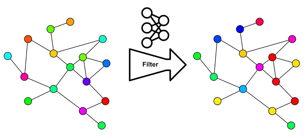
The idea of a graph convolutional network is somewhat similar, except graphs have a more complex structure than images, and thus it’s difficult to conceptualize them as a kernel neatly sliding over an image. Graph convolutional networks employ a different conceptualization: message passing.
Consider our graph, where we have a vector of information for each node and connections between each node.

The idea of graph convolution is to allow each node to pass messages to neighboring nodes, such that the content of each node has the ability to interact with neighboring nodes.

This happens in an iterative loop, which can be conceptualized as a “layer” of the model. The modified messages from one layer can be passed to another layer for further message passing. This can be done in as many layers as we desire.

There’s an interesting parallel between traditional convolution and graph convolution. In traditional convolution, there’s a concept of a “receptive field”. Essentially, because we’re using layers of small kernels to allow pixels in an image to interact with each other, data within the network is only able to see certain pixels in the input image.

Similarly, because graph convolutional networks exist on layers of neurons passing networks between neighbors, the number of layers we have dictates how far into the distance a particular node can “see”.

Thus, you can play around with the number of graph convolutional layers to play around with how much your model is focusing on nearby vs distant relationships.
Another important idea in graph convolutional layers is… how they actually learn stuff. We have an idea that messages get passed around, but what are these messages and how do they get created?
In a traditional convolutional network, the learnable parameters reside in the kernel itself. So, we propagate a tiny square of values through the input, and we “train” a convolutional network by modifying the values within this kernel.

In graph neural networks there’s a similar idea. We create a neural network that exists between all connections and modifies the messages that are passed.
Just like how, in a traditional convolutional network, you can stack layers of convolutions on top of each other to create more in-depth understanding; in graph convolutional networks, you can stack layers of these neural networks on top of one another which modify how signals are passed.

This is, to a large extent, why graph convolutional networks have their name, they bear a striking resemblance to traditional convolutional networks. That said, there are some particular ideas in graph convolutional networks which are unique. Let’s dig into graph convolutional networks and form a more thorough understanding.
Diving Into Graph Convolutional Networks
Graph convolutional networks were popularized in the 2016 paper Semi-Supervised Classification with Graph Convolutional Networks. There’s a lot of math going on in this paper, but it all boils down to a single function.

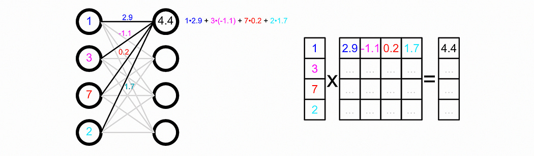
This function describes a layer of a graph convolutional network. There’s some subtle linear algebra going on here, but it fundamentally obeys the rules of message passing we described previously.
Here H represents the “hidden state” of each node in our graph, i.e. the vector associated with each node. We’re creating a new hidden state for our nodes ( H(l+1) , l+1 symbolizing the next layer )based on some math and the previous hidden state ( H(l) , l symbolizing the current layer). The hidden state, in this example, is formatted as a matrix, where each row of the matrix corresponds with a particular node.

Our input hidden state is multiplied by a weight matrix and then passed through an activation function. The way matrix multiplication shakes out, this is equivalent to passing our data through a neural network where the parameters of that neural network are within the matrix W .
Here, ReLU is an activation function. To make a long story short, this sprinkles in some complexity between our input and our output, which can help our model learn more complex things.

We’re not just passing our vectors through a neural network, though, we’re multiplying them by à before multiplying them by our weight matrix. Here à is the adjacency matrix, which describes which nodes are connected.
I talk about adjacency matrices in my article on graphs. The idea is that we can record the connections in a graph with a matrix, where we have a row and a column for each node in our graph. When constructing an adjacency matrix you stick a 1 where there’s a connection and a 0 where there isn’t a connection.


Here à is not the adjacency matrix, but rather a modification of the adjacency matrix where the diagonal is set to 1 . This modification makes each node connect with itself.

This is important as, when we’re doing convolution, we want the update of each node to be based on the node's previous value, as well as the value of all connected nodes.
When we multiply this adjacency matrix by H (the previous values of all of our nodes as a matrix), we allow the representation of all of the connections of the nodes to be combined, and then that combination becomes the new representation for that node.

You might notice, that the values resulting from message passing in the previous example are much larger than H1. That’s the point of that wacky multiplication going on around the adjacency matrix.

The essential idea is to scale down the values in the adjacency matrix so that nodes with a lot of connections have smaller contributions, and nodes with only a few connections have larger contributions. This keeps values from becoming astronomically large in graphs with a lot of connections.
The D̃ symbol represents the degree matrix. The “Degree” of a node is the number of connections that node has, so the “Degree matrix” simply records the number of connections each node has. It has a ~ over it because it includes the self-connections in the à matrix.

Essentially, we’re using the degree matrix to scale down the values in the adjacency matrix, before using that to aggregate values in the hidden matrix. That result is passed through the neural network (by multiplying by the weight matrix and passing through the activation function).
The process of scaling down these values based on the number of connections is called “normalization”. Normalization happens a lot in machine learning and happens when you have to squash values down to account for imbalances in your data.
There’s one little quirk to this: Why are we multiplying by the degree matrix twice?
We do this because matrix multiplication is fundamentally asymmetrical. The rows of the first matrix get multiplied by the columns of the second matrix. If we only multiplied by the inverse of our degree matrix once, either before or after the adjacency matrix, we would asymmetrically be normalizing either rows or columns. By multiplying in this way, we’re scaling down our adjacency values without a preference for rows or columns.
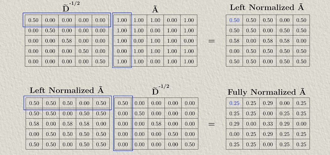
Once you’ve normalized the adjacency matrix by the degree matrix, you can then multiply it by H1 to do message passing, then you can multiply the result of that through the neural network by multiplying it by W1 , and then through the activation function. The whole idea is that you can stack these layers on top of each other. Each layer will have a different W matrix, and thus can learn to manipulate the vectors which result from previous manipulations.
Clear as mud? I’m planning on writing a few articles on some more fundamental math if you’re not comfortable. Let’s step away from theory and get into practice by loading up the Cora dataset.
Have any questions about this article? Join the IAEE Discord.
Loading And Understanding the Dataset
Let’s get into actual implementation, full code can be found here:
First, we need data to play with, and to get that data we’ll use the torch_geometric package.
!pip install torch_geometrictorch_geometric is a library built on top of pyTorch that’s designed to deal with graphs. There are a variety of models which can be applied to graph data, and also a variety of datasets.
torch_geometric.datasets organizes datasets based on their source paper, as can be seen in the dataset cheatsheet for torch geometric. Cora is from the Planetoid paper, and thus we can download the Cora dataset given the following code:
from torch_geometric.datasets import Planetoid

dataset = Planetoid(root='./data', name='Cora')
data = dataset[0] #<- just because of a quirk of the way the dataset is structured
We can go ahead and extract some key metrics about this data to better understand what we’re dealing with.
print(f"Num Nodes: {data.num_nodes}")
print(f"Num Features per Node: {data.num_node_features}")
print(f"Num Classes: {dataset.num_classes}")
So, there are 2708 nodes, each of which corresponds to some academic paper. Each of those nodes has a vector of 1,433 values, which is the bag of words corresponding to each paper, and there are 7 types of papers a particular paper can belong.
The data composing the graph can be retrieved via the following:
print('feature data: ', data.x.shape)
print('adjacency data: ', data.edge_index.shape)
print('example of a few edges:')
print(data.edge_index[:,0:10])
print('labels: ', data.y.shape)
Here, data.x is the bag of words for each node in our graph, expressed as a 2D matrix where the first axis corresponds to the documents, and the second axis corresponds to the bag of words. data.y is a vector that has a number for each node describing which of the 7 classes of papers a node belongs to.
The data.edge_index records each edge in the graph, where each column represents the two nodes on each edge. This matrix consists of 10,556 edges, meaning there are 10,556 citations in this particular graph.
I cover the library networkx in-depth in another article. In a nutshell, it’s a library for creating and visualizing networks, and we can use this data to construct and visualize our graph.
import networkx as nx
import matplotlib.pyplot as plt

# Convert edge_index to NetworkX graph
edge_index = data.edge_index.numpy()
G = nx.Graph()
edges = edge_index.T.tolist()
G.add_edges_from(edges)

# Plot the graph
plt.figure(figsize=(5, 5))
nx.draw(G, node_size=20, with_labels=False)
plt.title("Cora Dataset Graph Visualization")
plt.axis('off')
plt.show()
This is a pretty nasty visualization, but it does tell us a few things: There are a bunch of islands where certain papers only cite a small number of other papers in the dataset. There’s also a massive connected subgraph in the center which has a bunch of interconnected citations.
To get a better feel for this data, we can choose a random node (paper) and visualize all of the nodes that are connected to that paper within some radius (number of connections). Here I’m doing that for four arbitrary nodes in the graph.
import torch
import networkx as nx
import matplotlib.pyplot as plt
from torch_geometric.utils import k_hop_subgraph
from matplotlib.patches import Patch

# Define label mapping
label_mapping = {
    0: "Theory",
    1: "Reinforcement_Learning",
    2: "Genetic_Algorithms",
    3: "Neural_Networks",
    4: "Probabilistic_Methods",
    5: "Case_Based",
    6: "Rule_Learning"
}

# Define a fixed color map to maintain consistency across subgraphs
fixed_colors = {
    label: plt.cm.tab10(i) for i, label in enumerate(label_mapping.keys())
}

# Visualize multiple subgraphs around specified nodes
def visualize_subgraphs(node_indices, radius=2):
    fig, axs = plt.subplots(2, 2, figsize=(12, 9))
    axs = axs.flatten()

    for ax, node_idx in zip(axs, node_indices):
        subset, edge_index, _, _ = k_hop_subgraph(node_idx, radius, data.edge_index, relabel_nodes=True)
        subG = nx.Graph()
        subG.add_edges_from(edge_index.t().tolist())

        # Get node labels
        node_labels = data.y[subset].tolist()
        node_colors = [fixed_colors[label] for label in node_labels]

        # Node sizes and shapes
        node_sizes = [200 if node == 0 else 50 for node in range(len(subset))]
        node_shapes = ['D' if node == 0 else 'o' for node in range(len(subset))]

        pos = nx.spring_layout(subG, seed=42)

        for i, node in enumerate(subG.nodes()):
            nx.draw_networkx_nodes(
                subG,
                pos,
                nodelist=[node],
                node_color=[node_colors[i]],
                node_size=node_sizes[i],
                node_shape=node_shapes[i],
                edgecolors='black' if node_shapes[i] == 'D' else None,
                linewidths=2 if node_shapes[i] == 'D' else 0,
                alpha=1.0
            )

        nx.draw_networkx_edges(subG, pos, alpha=0.5)

        # Use a single, consistent legend for all subgraphs
        if node_idx == node_indices[0]:  # Only create legend once
            legend_elements = [Patch(facecolor=fixed_colors[label], edgecolor='black', label=label_mapping[label])
                               for label in fixed_colors.keys()]
            ax.legend(handles=legend_elements, loc='best', title="Node Labels")

        ax.set_title(f"Subgraph of Node {node_idx} (Radius {radius})")
        plt.sca(ax)
        plt.axis('off')

    plt.tight_layout()
    plt.show()

# Example: Visualizing subgraphs around nodes 6, 100, 200, and 300
visualize_subgraphs(node_indices=[6, 100, 200, 300], radius=3)
Here, the diamond corresponds to the node selected, and the color of the node corresponds to the class of paper a node belongs to, and we’re plotting a subgraph of all connected nodes which are, at most, three connections away. As you can see, there is a ton of interconnectivity in this graph.
The bag of words associated with each of the nodes was a bit of a point of frustration for me, as I was exploring this dataset. From a modeling perspective, all we need is the matrix of which words appear in which papers, which we have in the form of data.x . However, I wanted to build an intuition as to exactly what types of words were being used, so I went on a bit of a scavenger hunt. I found two interesting sources:
A Reddit comment of someone quoting the documentation in a broken link: “After stemming and removing stopwords we were left with a vocabulary of size 1433 unique words. All words with document frequency less than 10 were removed.”
an
Rlibrary calledldathat allows me to loadcora.vocab, which is presumably the vocabulary used to construct the bag of words.
I’ve never actually used R, because I’m a fake data scientist, so I downloaded a library called rpy2 that allowed me to load the lda dataset and get cora.vocab in Python, just so I could take a peek at the words used to construct the bag of words for all the documents.
"""A bunch of hacky code in a quest to find the cora vocab for bag of words
"""

# Import necessary modules from rpy2
import rpy2.robjects as ro
from rpy2.robjects.packages import importr
from rpy2.robjects import pandas2ri

# Activate automatic pandas conversion
pandas2ri.activate()

# Install and import lda package from R
utils = importr('utils')
utils.chooseCRANmirror(ind=1)  # select a CRAN mirror
utils.install_packages('lda')

# Import the 'lda' package
lda = importr('lda')

# Load 'cora.vocab' dataset
ro.r('data(cora.vocab)')

# Retrieve vocabulary as a Python list
cora_vocab = list(ro.r('cora.vocab'))

print('all words in cora vocabulary:')
print(cora_vocab)
It seems like they removed stop words (words that have little meaning, like “and”, “but”, and “or”) and then only preserved words that are present in 10 or more papers. I printed out all of them in the code, so you can take a look if you want. There’s no guarantee the order of these words corresponds with our data, but we don’t need the words themselves so it doesn’t matter. I just wanted an idea of what types of words we were dealing with.
Recall how, in a previous section, we discussed how different nodes within the dataset are held out for validation purposes. We can explore exactly how that’s done with the following code block:
print(data.x.shape)
print(data.train_mask.shape)
print(data.train_mask)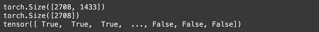
We can plot out some random subsets of the graph to create a visual understanding of how the partitions are distributed throughout the graph.
import torch
import networkx as nx
import matplotlib.pyplot as plt
from torch_geometric.utils import k_hop_subgraph

# Visualize subgraphs colored by dataset split
def visualize_subgraphs_by_split(node_indices, radius=2):
    fig, axs = plt.subplots(2, 2, figsize=(12, 12))
    axs = axs.flatten()

    for ax, node_idx in zip(axs, node_indices):
        subset, edge_index, _, _ = k_hop_subgraph(node_idx, radius, data.edge_index, relabel_nodes=True)

        # Determine node colors based on split
        node_colors = []
        for idx in subset.numpy():
            if data.train_mask[idx]:
                node_colors.append('green')
            elif data.val_mask[idx]:
                node_colors.append('blue')
            elif data.test_mask[idx]:
                node_colors.append('yellow')
            else:
                node_colors.append('gray')  # unknown or unspecified

        # Legend elements
        legend_elements = [
            plt.Line2D([0], [0], marker='o', color='w', label='Train', markerfacecolor='green', markersize=10),
            plt.Line2D([0], [0], marker='o', color='w', label='Validation', markerfacecolor='orange', markersize=10),
            plt.Line2D([0], [0], marker='o', color='w', label='Test', markerfacecolor='red', markersize=10),
            plt.Line2D([0], [0], marker='o', color='w', label='None', markerfacecolor='gray', markersize=10)
        ]

        subgraph = nx.Graph()
        subgraph.add_edges_from(edge_index.t().tolist())

        pos = nx.spring_layout(subgraph)
        nx.draw(
            subgraph,
            pos,
            ax=ax,
            node_color=node_colors,
            edge_color='gray',
            with_labels=True,
            node_size=200
        )

        ax.set_title(f"Subgraph of Node {node_idx} (Radius {radius})")
        ax.legend(handles=legend_elements, loc='best', title="Dataset Splits")
        ax.axis('off')

    plt.tight_layout()
    plt.show()

# Example usage:
visualize_subgraphs_by_split([10, 50, 100, 200], radius=3)
I’m not sure how partitions were defined. They seem to have some structure to them, but it’s also entirely possible that the partitions are completely random. If I were making this dataset I would do perfectly random partitions, but that’s just me.
Anywho, we have an idea of the dataset fundamentals. It’s a graph with a bag of words and connections associated with each node. Before we get into GCNs let’s quickly review the naive modeling strategies we discussed previously.
A Quick Review of the Naive Strategies
Recall that majority voting uses the label of the surrounding nodes to infer the label of some new node.
from collections import Counter

correct = 0
total = 0

# Iterate through all test nodes
for node_idx in torch.where(data.test_mask)[0]:
    neighbors = list(G.neighbors(int(node_idx)))

    # Consider only labeled neighbors (training nodes)
    neighbor_labels = [int(data.y[neighbor]) for neighbor in neighbors if data.train_mask[neighbor]]

    if neighbor_labels:
        # Predict using majority voting
        predicted_label = Counter(neighbor_labels).most_common(1)[0][0]
    else:
        # Default prediction if no labeled neighbors: majority label in training set
        predicted_label = Counter(data.y[data.train_mask].tolist()).most_common(1)[0][0]

    true_label = int(data.y[node_idx])

    if predicted_label == true_label:
        correct += 1
    total += 1

accuracy = correct / total
print(f"Majority-vote accuracy on test nodes: {accuracy:.4f}")
One thing we didn’t discuss is that this approach uses the labels as actual data in predicting some new paper. You need to know the classification of connected papers to infer the classification of a new paper. This is great if you’re just adding one or two papers to a well-known dataset, but if you add more and more papers with an unknown classification to this dataset, or if you don’t want to go through the hassle of manually labeling all these papers, this strategy isn’t that great.
The MLP approach, on the other hand, is much more general. One might expect it to be robust to additional papers being added to the graph because we’re treating each paper independently and modeling only on the bag of words.
import torch.nn.functional as F

# Define a simple neural network (MLP)
class SimpleMLP(torch.nn.Module):
    def __init__(self, input_dim, hidden_dim, output_dim):
        super(SimpleMLP, self).__init__()
        self.fc1 = torch.nn.Linear(input_dim, hidden_dim)
        self.fc2 = torch.nn.Linear(hidden_dim, output_dim)

    def forward(self, x):
        x = F.relu(self.fc1(x))
        return self.fc2(x)

# Initialize the model
model = SimpleMLP(dataset.num_features, 32, dataset.num_classes)
optimizer = torch.optim.Adam(model.parameters(), lr=0.01)

train_losses = []
val_losses = []

# Training loop
for epoch in range(15):
    model.train()
    optimizer.zero_grad()
    out = model(data.x)
    loss = F.cross_entropy(out[data.train_mask], data.y[data.train_mask])
    loss.backward()
    optimizer.step()

    train_losses.append(loss.item())

    # Validation
    model.eval()
    with torch.no_grad():
        val_out = model(data.x)
        val_loss = F.cross_entropy(val_out[data.val_mask], data.y[data.val_mask])
        val_losses.append(val_loss.item())

# Plot losses
plt.figure(figsize=(10, 5))
plt.plot(train_losses, label='Training Loss')
plt.plot(val_losses, label='Validation Loss')
plt.xlabel('Epoch')
plt.ylabel('Loss')
plt.title('Training and Validation Loss')
plt.legend()
plt.show()

# Evaluate on test set
model.eval()
with torch.no_grad():
    logits = model(data.x)
    preds = logits[data.test_mask].argmax(dim=1)
    correct = (preds == data.y[data.test_mask]).sum().item()
    total = data.test_mask.sum().item()

test_accuracy = correct / total
print(f"Test accuracy: {test_accuracy:.4f}")
This is, in some ways, better than majority voting because it’s more general, with labels only being used for training the model instead of being important in classifying new papers. Still, though, the performance is less than ideal.
Ok, let’s stop beating around the bush and get to brass tax.
Defining and Training a Graph Convolutional Network
Using the magic of PyTorch, we can define a GCN very easily
import torch.nn.functional as F
from torch_geometric.nn import GCNConv

class GCN(torch.nn.Module):
    def __init__(self, num_features, hidden_channels, num_classes):
        super(GCN, self).__init__()
        self.conv1 = GCNConv(num_features, hidden_channels)
        self.conv2 = GCNConv(hidden_channels, num_classes)

    def forward(self, x, edge_index):
        x = self.conv1(x, edge_index)
        x = F.relu(x)
        x = F.dropout(x, p=0.5, training=self.training)
        x = self.conv2(x, edge_index)
        return x

model = GCN(num_features=dataset.num_node_features, hidden_channels=16, num_classes=dataset.num_classes)
print(model)
Here we’re defining two graph convolutional layers. The first layer processes the raw bag of word vectors, does messages passing between neighbors, and then passes the aggregate of all of the messages for a particular node through a neural network to create the next hidden state for that node. That hidden state is a vector that is 16 numbers long. So, we now have a 16-number long vector for each node.
Then, we pass through another layer of GCN, which has 7 outputs. This is our output layer, with the 7 values created for each node corresponding to the 7 possible classifications of papers.
Recall the idea of a “receptive field”. Because there are only two layers in this GCN, the GCN can only use the information from up to two nodes away when creating a classification prediction for a node.
Because we’re too cool for school, we can ditch the premade GCN in PyTorch (which probably has a bunch of fancy optimization I’m taking for granted) and implement our own from scratch.
import torch
import torch.nn as nn
import torch.nn.functional as F

class GCNLayer(nn.Module):
    def __init__(self, in_features, out_features):
        super(GCNLayer, self).__init__()
        self.linear = nn.Linear(in_features, out_features, bias=False)

    def forward(self, x, edge_index):
        num_nodes = x.size(0)

        # Create adjacency matrix (including self-loops)
        edge_index = torch.cat([edge_index, torch.arange(num_nodes).repeat(2, 1)], dim=1)
        row, col = edge_index

        # Compute degree matrix
        deg = torch.bincount(row, minlength=num_nodes).float()
        deg_inv_sqrt = deg.pow(-0.5)
        deg_inv_sqrt[deg == 0] = 0  # Avoid division by zero

        # Construct D^(-1/2) * A * D^(-1/2)
        D_inv_sqrt = torch.diag(deg_inv_sqrt)
        A = torch.zeros((num_nodes, num_nodes), dtype=torch.float32)
        A[row, col] = 1  # Fill adjacency matrix
        A_norm = D_inv_sqrt @ A @ D_inv_sqrt  # Normalize A

        # Propagate features
        x = A_norm @ x  # Matrix multiplication with normalized adjacency
        x = self.linear(x)  # Apply learned transformation
        return x

class GCN(nn.Module):
    def __init__(self, num_features, hidden_channels, num_classes):
        super(GCN, self).__init__()
        self.conv1 = GCNLayer(num_features, hidden_channels)
        self.conv2 = GCNLayer(hidden_channels, num_classes)

    def forward(self, x, edge_index):
        x = F.relu(self.conv1(x, edge_index))
        x = F.dropout(x, p=0.5, training=self.training)
        x = self.conv2(x, edge_index)
        return x

# Example usage:
model = GCN(num_features=dataset.num_node_features, hidden_channels=16, num_classes=dataset.num_classes)
print(model)
This is the same fundamental model, except the GCN layer is defined manually. This is an implementation of the GCN equation we discussed previously.
We can train either the PyTorch version or our custom version of a GCN with the following code.
optimizer = torch.optim.Adam(model.parameters(), lr=0.01, weight_decay=5e-4)
criterion = torch.nn.CrossEntropyLoss()

def train():
    model.train()
    optimizer.zero_grad()
    out = model(data.x, data.edge_index)
    loss = criterion(out[data.train_mask], data.y[data.train_mask])
    loss.backward()
    optimizer.step()
    return loss.item()

def test():
    model.eval()
    out = model(data.x, data.edge_index)
    pred = out.argmax(dim=1)

    accs = []
    for mask in [data.train_mask, data.val_mask, data.test_mask]:
        correct = pred[mask] == data.y[mask]
        accs.append(int(correct.sum()) / int(mask.sum()))
    return accs

for epoch in range(1, 201):
    loss = train()
    train_acc, val_acc, test_acc = test()
    if epoch % 20 == 0 or epoch == 1:
        print(f'Epoch: {epoch:03d}, Loss: {loss:.4f}, Train Acc: {train_acc:.4f}, Val Acc: {val_acc:.4f}, Test Acc: {test_acc:.4f}')
The actual training is relatively simple. We pass our data into the model, get some output, and compare that output to our known output via cross-entropy loss. Under the hood, the hidden states of all nodes are being affected by message-passing neural networks to ultimately create a vector of 7 numbers, one for each possible class. If the biggest number in that vector is at index 0, then that vector predicts class 0. If the biggest number is in index 1, then the vector predicts class 1. Etc.
That prediction is compared to the known class of the node. Then, both of the neural networks in both layers are updated to produce better predictions for all of the nodes in the training set.
All of the nodes still exist, but we’re only training the model to update based on the training partition. We then test on different nodes which our model was not optimized to perform well at.
Thus we’ve trained a GCN to classify which topic a paper belongs to based on the content of that paper and how it relates to different papers via references. Before we wrap up, though, a bonus section.
Graph Embedding
This is kind of hard to talk about because it’s somewhat advanced from a data science perspective. Basically, there’s a prevailing conception in AI called embedding, which means you can treat some data like a vector. If you plot where those vectors land in space, you might want certain vectors to be close together, and certain vectors to be far apart.
If we imagine our bag of words as a location in high dimensional space, we might imagine that different types of papers might occupy different regions in this space. You might also imagine this space to be somewhat noisy, as different paper types might share many words in common.
As our GCN refines these vectors over several layers, one might expect the vectors used to describe each node to be more discriminatory between different classifications. Because the model is learning to classify papers, one might imagine that the internal vectors are better at specially dividing different types of papers.
We can go ahead and test that out. Here I’m using a popular data science tool called t-sne (which I’ll be covering soon) to map the bag of words into two dimensions, so we can see how well the bag of words separated papers of different types, and I’m doing the same thing with the hidden layer which is output from our first GCN layer.
from sklearn.manifold import TSNE
import matplotlib.pyplot as plt

# Ensure model is in evaluation mode
model.eval()
with torch.no_grad():
    embeddings = model.conv1(data.x, data.edge_index)

# Apply t-SNE to raw features
tsne_raw = TSNE(n_components=2, random_state=42)
raw_features_2d = tsne_raw.fit_transform(data.x.cpu().numpy())

# Apply t-SNE to GCN embeddings
tsne_emb = TSNE(n_components=2, random_state=42)
embeddings_2d = tsne_emb.fit_transform(embeddings.cpu().numpy())

# Plot both embeddings side-by-side
fig, axes = plt.subplots(1, 2, figsize=(20, 8))

# Plot raw features
scatter_raw = axes[0].scatter(raw_features_2d[:, 0], raw_features_2d[:, 1],
                              c=data.y.cpu().numpy(), cmap='coolwarm', s=50)
axes[0].set_title('t-SNE of Raw Node Features')
axes[0].set_xlabel('t-SNE Component 1')
axes[0].set_ylabel('t-SNE Component 2')
fig.colorbar(scatter_raw, ax=axes[0], label='Class Label')

# Plot GCN embeddings
scatter_emb = axes[1].scatter(embeddings_2d[:, 0], embeddings_2d[:, 1],
                              c=data.y.cpu().numpy(), cmap='coolwarm', s=50)
axes[1].set_title('t-SNE of GCN Embeddings')
axes[1].set_xlabel('t-SNE Component 1')
axes[1].set_ylabel('t-SNE Component 2')
fig.colorbar(scatter_emb, ax=axes[1], label='Class Label')

plt.tight_layout()
plt.show()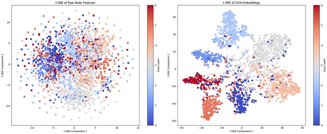
As can be seen, there is some discriminatory positioning happening in the bag of words, but not nearly as much as in the hidden layer of our GCN.
Conclusion
I don’t know about you, but I learned a lot.
Graph Networks have always felt elusive and unintuitive to me. I find more simply structured data like text, audio, and images to be fairly intuitive to model on, but graphs with their complex and abstract structure feel much more counterintuitive to model on. At least, in my opinion.
The idea of thinking of modeling on graphs as a convolution that modifies messages makes a lot of sense, and is a gateway drug into understanding graph modeling. Really, though, understanding how the adjacency matrix facilitates that message passing through matrix multiplication really opened my mind. It makes me reflect on transformers, and the attention matrix, and how conceptually similar that is.
Anywho, in this article we reviewed what a graph is, learned what a graph convolutional network is, and then applied a GCN to a dataset that had to do with understanding what classification some academic paper belonged to, based on information about that paper and which other papers referenced that paper.
Naturally, I think you might be able to imagine that this form of modeling is useful for a variety of use cases. I’ll be covering some of those soon!